Pale Ale Beer
Packaging Design.
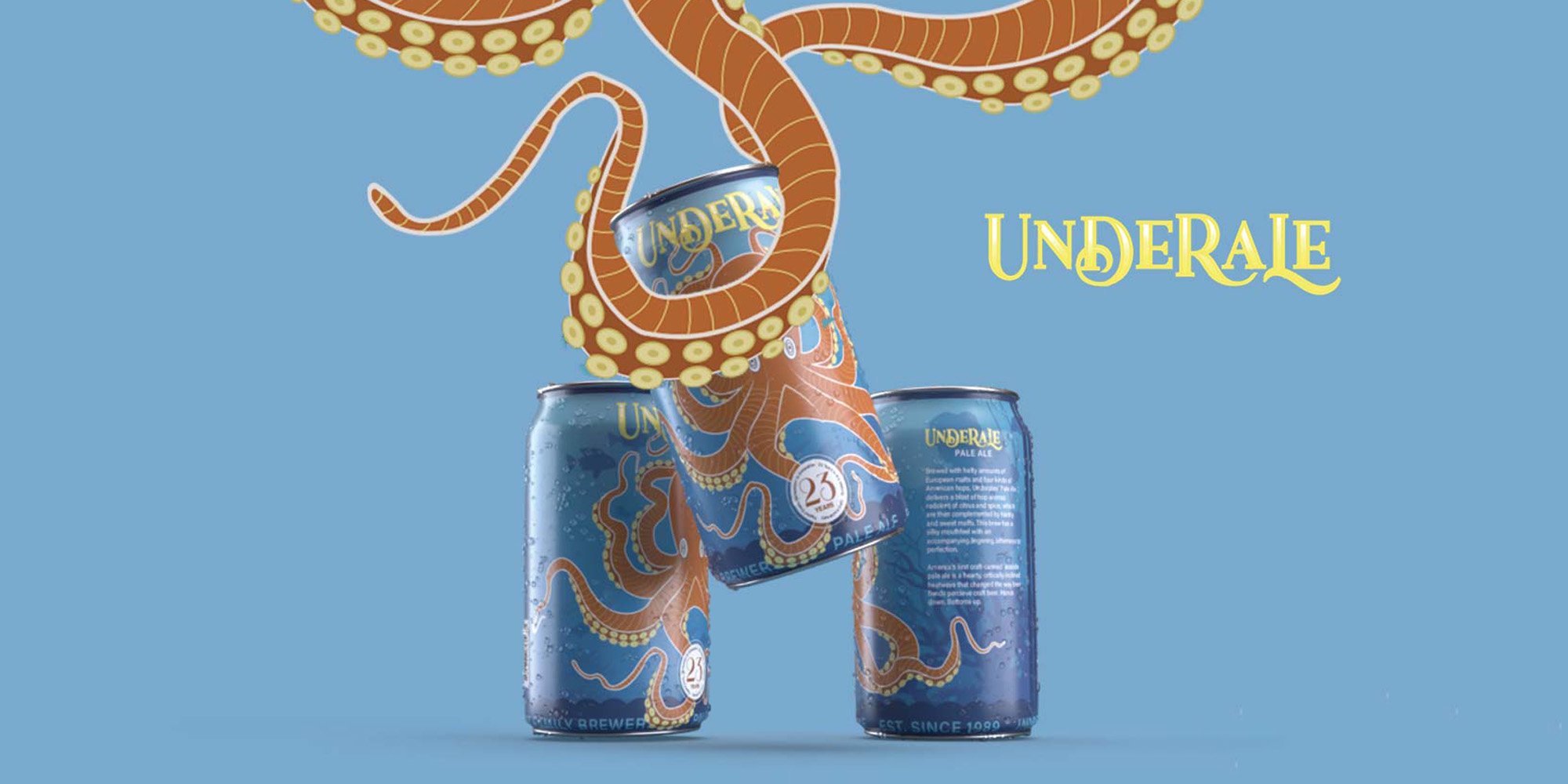
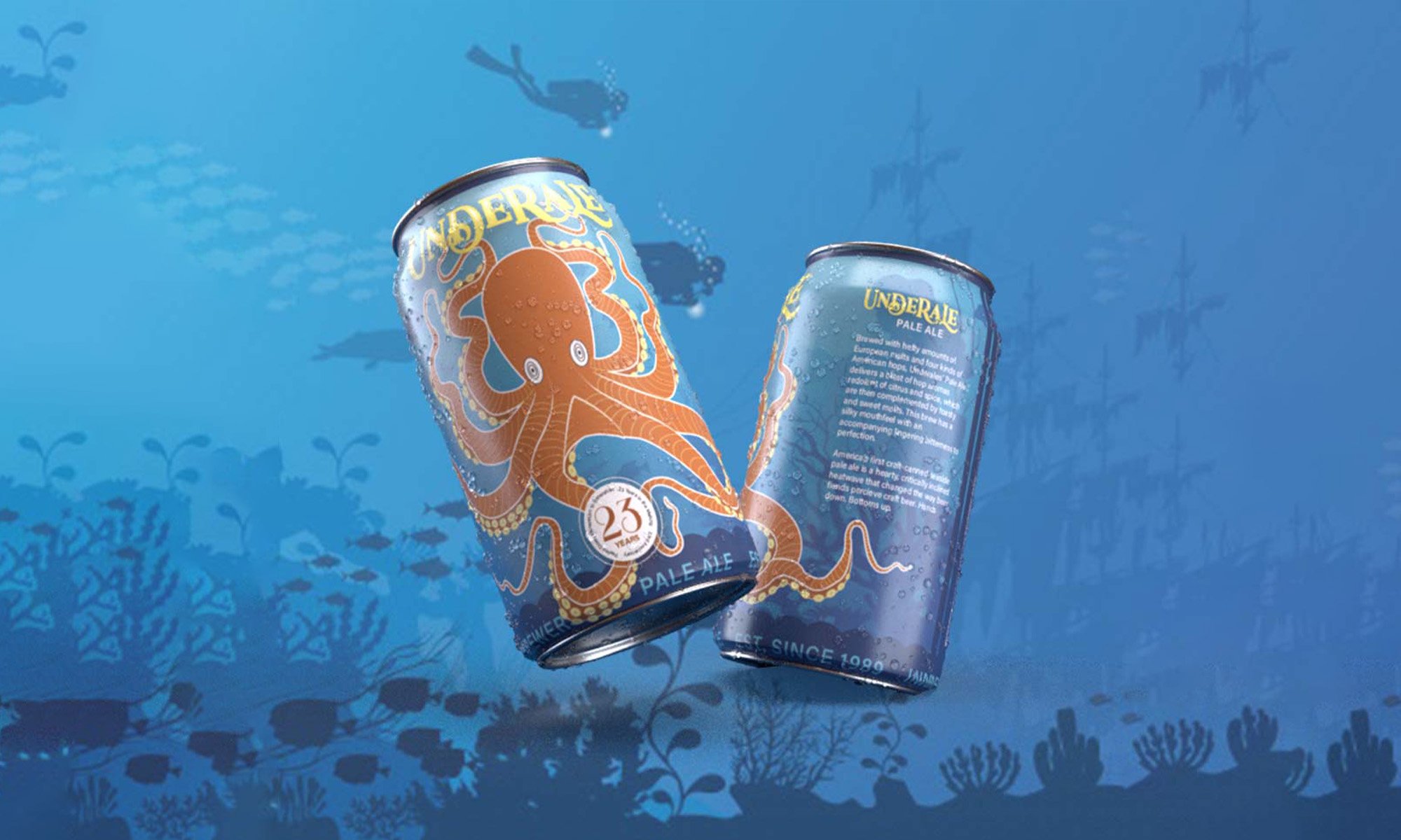
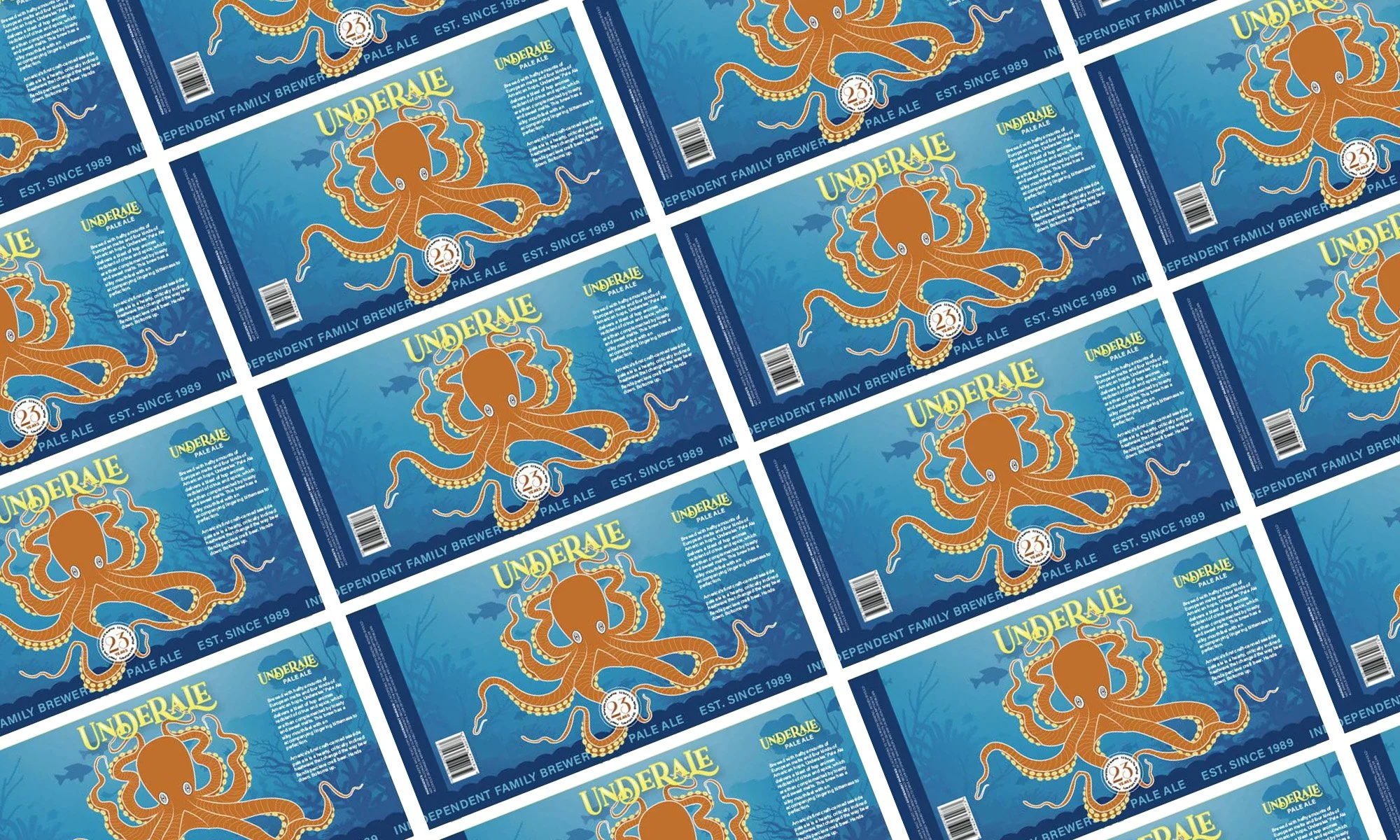
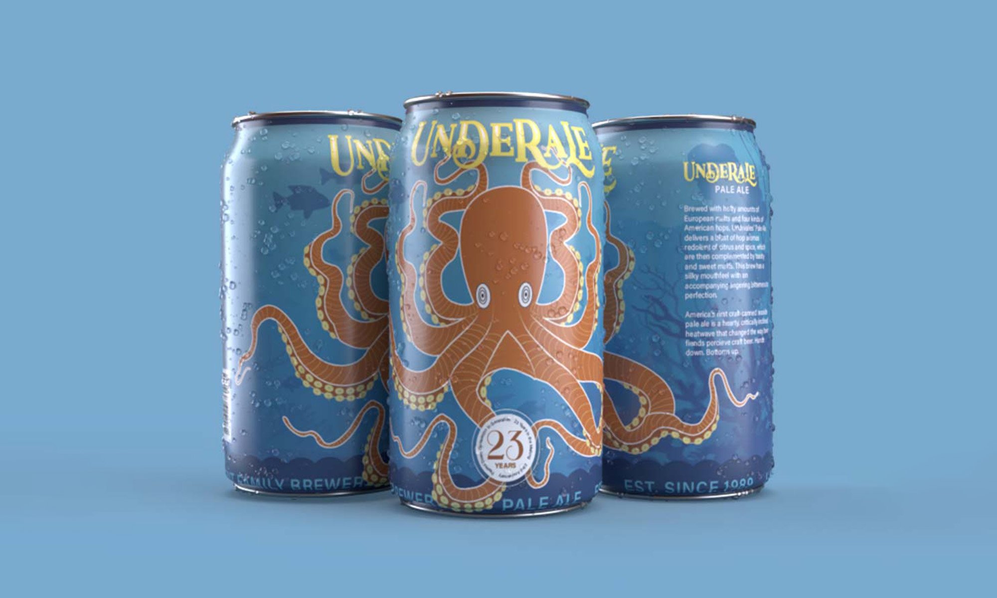
This pale ale has an underwater theme with an octopus, explaining its bubbly taste that hooks its customers by the tentacles. The can itself holds complementary branding colors of different shades and tints of blue and orange. The logo creates an automatic relation to oceanic ambiance simply through type.
The main goal of this packaging is to stand out from all other domestic beers. When three cans are place together in close proximity it is to resemble the large octopus connecting on all 3 cans seamlessly.


